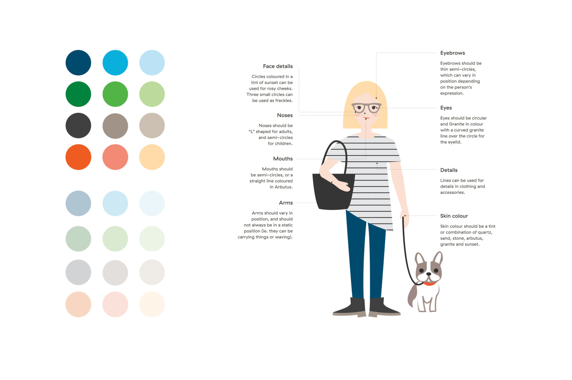
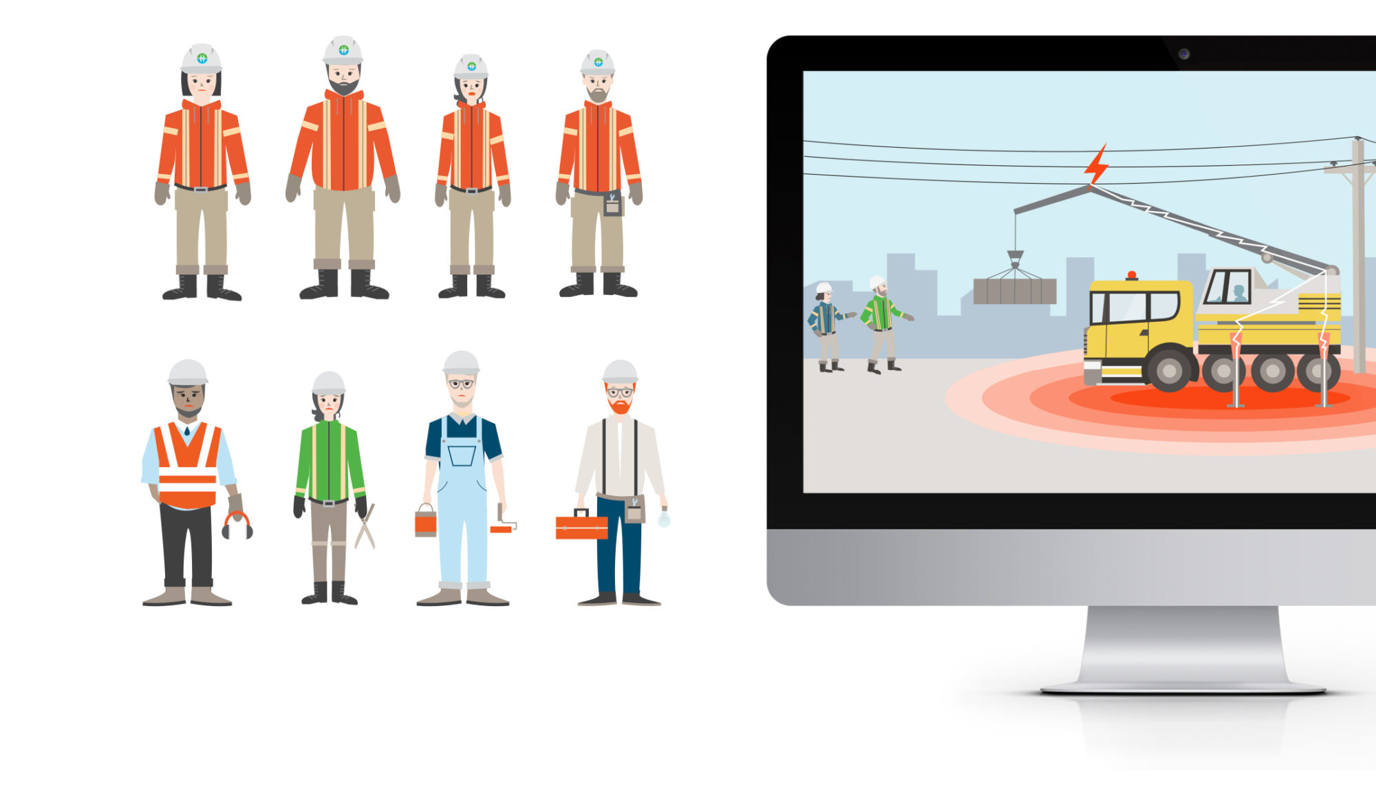
At TAXI I had the fun job of illustrating vector style people for BC Hydro’s rebrand. My task was to create an illustration style of people that is modern and approachable, yet serious enough to convey important safety instructions.
I was able to achieve this by creating simple illustrations, that were symmetrical and made up of geometric shapes and flat colour. People’s expressions range from being happy to neutral, to a state of shock and pain, (such as in an electrical safety situation).
We also ensured that the illustrations were inclusive, representing different genders, ages, body types and ethnicities.
Illustrator | Michelle lim
Agency | TAXI Advertising
ACD | Sofia Pona


